


In Defense of Beauty
An unsolicited opinion on unequal aspect ratios

If you’ve ever talked to me for longer than five minutes, you’ll have noticed my tendency to ramble or my complete misunderstanding of the term “summary.” This unfortunate quality — my affinity for storytelling, even at the cost of coherence — is something I have tried many times to correct, with little to no success. There are some benefits, though: my High School English teachers liked me (I think), the SAT vocab section was a piece of cake (hooray!), and Grammarly considers my mean sentence length “above average” (that’s good, right?). All that to say, I feel pretty confident when it comes to writing, and specifically, storytelling; I can paint you a semi-decent picture, just don’t ask me to do it on a canvas.
In utter contrast to (or perhaps because of) my love of the word as a medium for creativity, my artistic skills have never been particularly impressive. I found this frustrating as a child — that all too familiar “it’s in my head but I can’t get it onto the page” plaguing every attempt…
(Please forgive me for the following sentence, as I worry it’ll betray the true extent of my nerdery.)
That was until I found data visualization.1
I am not joking when I say that matplotlib is the most useful tool for creating visual art that I have ever used in my life. I sincerely believe that part of the reason why I have become so infatuated with soccer analytics as a whole over the last year is because it has offered me a creative outlet unlike any other in my life. Sure, I love creative writing and poetry, but there’s something tangibly different between seeing words on a page and seeing images unfolding before our eyes. I think that contributes to why we as humans are much quicker to suss out an AI-generated image than to identify text written by Chat-GPT2; we trust and put more value in what our eyes see. As a consequence of that, we tend to reward visual art forms more than other mediums, for better or worse. Despite my love of stories and storytelling, I, first and foremost, always wanted to create that type of “literal” art. The stuff you can see and analyze and deconstruct. Yet, I never quite got there. Until now.

The beauty of soccer cannot, and should not, be disputed. I will argue, however, that there too lies beauty in data visualization. When I started designing the match reports, when I figured out how to add shot maps and team logos, and even when I overcame my irrational fear of the hex code, I was never once motivated by the thought of “building my online portfolio.” I did it because making sick-looking graphics made me feel good and because of the immense sense of pride I felt at creating something others could look at and say: “Yeah, that’s cool.”
My strategy when approaching a new visualization thus has never been — and will never be — “cram as many details in as possible.” I have always prioritized aesthetics over volume, no matter what.
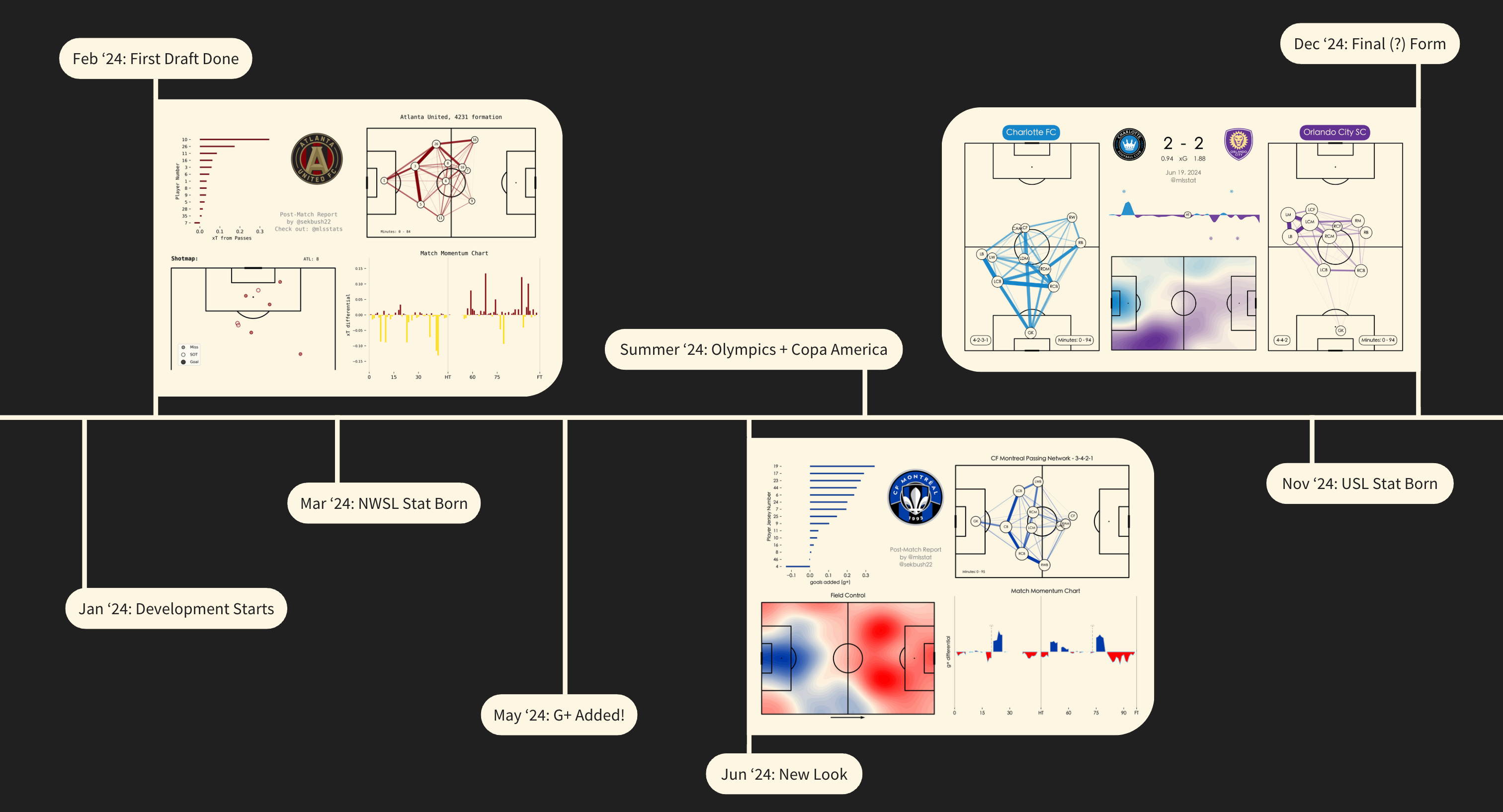
Every so often, I’ll come across a particular type of post-match report while scrolling LinkedIn or (when I still used it) Twitter. I think most of us who have spent even a little time on “analytics Twitter” have seen this style of graphic: the one with passing networks and defensive action plots and shot maps and ten other charts cascading down the single, 8.5x11 image until you can barely distinguish arrow from arrow and dot from dot. I’m not here to make fun of that type of graphic, nor do I think it’s any one person’s fault for popularizing its use. I mention it simply to say this: there are literally thousands of things you can put in a match report, but, in my opinion, the single best thing you can add is space. If the end goal of building a post-match report is to showcase your skills, by all means, stunt on the haters. If, however, your goal is to create a digestible and insightful summary of any given game, then please, please, don’t forget the space.
“Visualizations aren’t useful if they make you want to look away.” - Someone I talked to at some point, I think
I have no experience or background in graphic design, but I don’t think you need to have any to make good data visualizations. I think you just need consistency and commitment to detail. To give you an idea of what I mean, here’s some of the most useful code I’ve ever written:
if league == 'MLS':
    bg_color = '#fdf6e3'
    l_color = 'black'
elif league == 'NWSL':
    bg_color = '#0c1f2e'
    l_color = 'white'
else:
    bg_color = '#202020'
    l_color = 'white'

plt.rcParams["font.family"] = ["Heiti TC"]
It’s not really rocket science. It’s sticking to one font, one color, and one style. It’s making sure all of your numbers are rounded to one or two decimal places. It’s using team colors when possible but also having a fallback if the colors look too similar (FC Dallas - St. Louis City SC matchups come to mind). It’s fixing the small stuff, even if it’s painfully annoying.
I won’t sit here and say that my graphics are perfect or that there aren’t any ways I can improve on them because:
That isn’t true
I don’t want it to be true
As I said, it’s a very rewarding feeling to look at the pretty end product you just created, but that isn’t where the true fun of data visualization is derived. The good stuff is the painstaking, incremental, frustrating, exhilarating process. And, without endless iteration, let’s face it, the graphics would suck.
A couple of weekends ago, I had the incredible opportunity to go to the inaugural American Soccer Insights Summit in Houston, Texas, and present on stage as part of a research competition. Seven groups (including my own) were given some SkillCorner data, a month to complete a project, and then less than ten minutes to present the findings at the summit. In retrospect, the presentation was probably harder than the project — how do you fit all that information into such a tiny window?

Well, if you’re me, you find the SkillCorner presentation font, download the file, load it into matplotlib, find the hex code for the signature SkillCorner green, and cook up some visualizations.
About a minute after I walked off stage and took my seat,
started talking, and everyone — including myself — forgot all about wingers and wingbacks. His speech, titled “Numbers Talk — Now Make Them Tell a Story,” is probably a much better articulation of many of the above thoughts than I could possibly write. Overall, one sentiment stuck with me: at the end of the day, you can’t let data drive the narrative. Every creator, whether analyst or scientist or writer, must use the data as a tool, not the other way around.3Ultimately, if you spend enough time building a good graphic, you become, in a sense, a storyteller. When I got up on stage in Houston, it didn’t matter whether I’d run six XGBoost models or plugged some numbers into an abacus; all anyone cared about was how I presented it. It’s the exact same principle for data visualization — you have to display the data well.

At a certain point, we all must ask ourselves: “Is this really worth it?” You may believe that spending an extra hour, or two hours, or ten hours on something just so that it looks good isn’t worth it.4 That’s okay. You have to ask yourself the following questions, though:
“Why do people want to look at data visualizations?”
“How do you tell a good story in a graphic?”
The answer to both is beauty.
Sometimes, I sound like I’m performing a really elaborate satire of the “creating shareholder value” character, but I promise that’s not what this is. I kind of wish it was, to be honest.
I don’t have data to back this up (*gasp*); this is just based on my own experience. I’d also add that the general level of annoyance and immediate revulsion is usually much higher for AI-generated “art.” I’m a hater; sue me.
I’m referring specifically to Data Scientists, Analysts, and Writers in this sentence. I am not arguing that scientific fields should treat data as a tool rather than a driver. Also, I would love to hear alternate opinions on this if anyone feels strongly against this viewpoint.
I will admit that I’m still too easily wrapped up in things that are largely inconsequential (trying to build a custom loading bar that would appear on screen for all of five seconds, for example), but for every rabbit hole that goes nowhere, there are three that add real value to whatever I’m working on.
Fellow data geek here, but oh boy am I in the minor leagues! Can't wait to see what's next on this journey.